Imagine if a drought took out a quarter of wheat production in the US midwest. Who would go hungry? What if port workers in Rotterdam went on strike, or the Suez Canal was blocked?
For that matter, where did the food on your plate come from, and how did it get there?
We built the Global Food Twin to highlight our incredible global food system, and to expose its fragility to the climate crisis and conflicts.

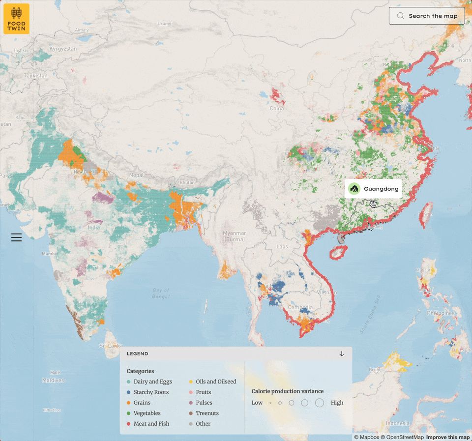
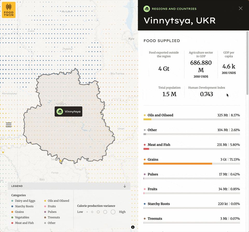
Explore (only on desktop, for now) the map to see key food production of 10 core food group. Click on any of the over 3500 sub-national units to see key stats, such as exports from the region, agriculture's share of GDP, and select socio-economic data. Scroll down on the sidebar to see how some of those calories flow around the world. Continue scrolling to see how where people are eating them.

Some data points reveal this fragility:
- Roughly 9% sub-national units (admin1, such as states or provinces) account for 80% of the global flows of calories. 5.5% of sub-national units produce 50% of the world's grain supply. Disruptions here will reverberate around the world.
- Exports to China represent 15% of all global flows, with Brazilian exports to China being the largest total global trade volume.
- Roughly 65% of exports are by sea and 25% by rail, 10% by road and 1% by inland waterway (air transport excluded).
You can read more about it in an article by Grist, explore the source data, and visit the Github repo for the methodology. You can also read about our discovery and design process in this blog post.